Printing Orienteering Maps
Logos for major events
The logo for the IOF, Silva National Orienteering League, Orienteering Australia and the Australian Sports Commission are availabe in OCAD 9 format below. The logos may be used on Australian orienteering maps as required.
(1) Digital printing (CMYK)
National logos_9.ocd
(2) Spot colour, offset printing
NB Logo colours adjusted to the available spot colours used for orienteering maps.
National Logos Spot Colour Offset Sep 2011_09.ocd
Printing Methods
Spot colour, offset printing is recommended for all World Ranking Events.
In October 2010 the IOF produced guidelines for the printing of non-offset printed maps that may be used for World Ranking Events, guidelines available here.
For use in Australia, a summary sheet "Map Scale and Printing Method Decision Process" is designed to assist controllers, organisers and course planners when to use spot colour, offset printing or digital printing and what scale to use for an event.
Digital printed maps
In 2002 the IOF Map Commission began a project to gather the latest knowledge about non-offset printing. Results from this project are available at the Print Tech Project Site
A key output of the project is a 'test sheet' that can be printed from a digital printer for comparison to a spot colour, off set printed version of the same file. Digital copies of the 'test sheet' in both OCAD and PDF file format and instructions on using the test sheet may be downloaded from the Print Tech Project Site.
The 'test sheet' is recommended as a quality control tool for assessing the suitability of a particular printer in respect to print quality and colour reproduction for orienteering maps.
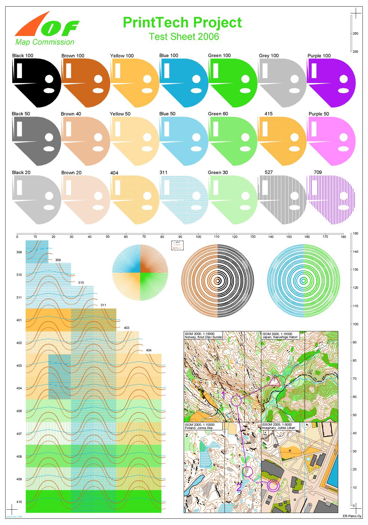
Copies of the Print Tech spot colour, off-set printed 'test sheet' are available from the OA Mapping Committee Chairperson.
When digitally printing maps it is critical that map colours match as much as is possible the colours of the spot colour, off-set printed 'test sheet' of the Tech Print project.
When comparing map colours it is useful to print colour blocks at one side of the map as per example, and then compare directly to the colour blocks of the 'test sheet'.
A colour table for OCAD10 specifically for use with a Fuji Xerox DocuColour 5065 laser printer as attached has been found to give good results.
In the same way as above the course marking colour can also be printed as a block colour at the side of the map. When using OCAD the default colour setting for course marking is 100% Magenta which results in a pink colour when printed and that this colour is unsuitable for colour blind orienteers. The default colour setting therefore needs to be changed to Purple which has a PMS colour setting of 43%Cyan, 91%Magenta, 0%Yellow and 0%Black. However this setting results in a printed colour that is too bright for normal colour vision hence a compromise setting has been adopted which is now recommended for Purple and being 30%Cyan, 100%Magenta, 15%Yellow and 0%Black.
As colour output varies from printer to printer, particularly from inkjet printers to laser printers, colour settings may need to be varied for each printer so as to achieve the best result. In all cases it is necessary to do trial print runs of the course map and check colours against the 'test sheet', and make adjustments as appropriate. If using an off-white waterproof paper it may be necessary to increase colour strength so as to ensure good differentiation of map colours.
To assist in the process of matching colour out put to the official colours the following colour swatch charts in OCAD9 format may assist:
Print_Tech_Project_Test_Sheet_2006.ocd
Purple colour_swatch 1.ocd
Purple colour swatch 2.ocd
Blue colour swatch.ocd
Yellow colour swatch.ocd
Green colour swatch.ocd
Printing Technology for Orienteering Maps by A Renolen, August 2010, provides a technical summary on the latest technology in the printing and graphics industry and its application to the printing of orienteering maps.
Some guidelines on digital printing for orienteering maps
Guidelines on digital printing may be found at the Mapsport web page. As at April 2012 the following papers were available:
Achieving-Overprint-in-Digital-Print-Maps.pdf
Course-planners-quick-guide-to-pdf-xchange1.pdf
Course-Planners-Simple-Guide-to-Digital-Print.pdf
Digital-Press-Operator-Guide-to-Process-Orienteering-Maps.pdf
O-Maps-ISO-player1.pdf
An edited version of the Power Point presentation "Mapping Workshop - Printing , 6 October 2011" may be found here.
Paper
Good quality white copy paper with a weight of 80-120 gsm is recommended for all digitally printed orienteering maps.
G-Print paper is recommended by the IOF PrintTech project although in Australia this paper is not available but replaced with Impress DM Matt, 100gsm.
A paper weight of 100 gsm is recommended when used with a plastic bag thickness of 0.10 mm.
Waterproof paper
The use of waterproof paper for orienteering maps is nothing new particularly for offset printed maps. The challenge now is to find suitable waterproof paper for use with digital laser printers which operate at high temperatures.
The real test with any waterproof paper is how well it is received by the orienteer. Factors to consider include:
- Paper weight (gsm) or thickness (microns)
- Flaking of print particularly at folds
- Durability and tear resistance
- Mud and blood resistance and ease of cleaning
- Stability of paper (thin paper less stable as it crinkles & flaps around more)
- Whiteness of paper
- Colour reproduction
- Ease of folding & unfolding, springiness
- Route marking by pencil or biro, and no smudging of ink
- Texture ie coarse or smooth, is it slippery
- No sharp edges or corners to the paper particularly when folded
- Cost
- Appearance ie shiny or dull (night orienteering?)
- Sticking together of damp or wet paper when in the start box (hard to pick up one map at a time)
A number of different types of waterproof papers have been tested over the last few years.
Two similar type waterproof papers are Never Tear and Picofilm. Both papers are bright white hence give excellent colour contrast, however their 'springy' nature is off-putting to many orienteers particularly when two or more folds of the map is required.
Two waterproof papers were used at major events in 2009. Teslin was used at both the World Masters Games in NSW and the Easter 3Day in Tasmania, while Pretex was used at the Australian Championships Carnival held in Victoria. Teslin was also used for the 2010 Easter 3Day in ACT. The downside of these two papers is that they are off-white in colour but on the positive side have better handling and folding charateristics as compared to Never Tear and Picofilm.
Two reports on waterproof papers are as follows:
The recommended paper weight or thickness for some waterproof papers are:
- Pretex: 50.120 (120 gsm)
- Teslin: 150 gsm
- Nevertear: 120 micron
- Picofilm: 150 gsm
A summary of waterproof papers that have been tested and found to be either suitable or unsuitable for orienteering use may be obtained from the OA Mapping Committee Chairperson.
Not withstanding the advances made in the quality and durability of waterproof papers, maps printed on good quality white paper (even though in a plastic bag) is generally recommended as the preferred paper for orienteering maps particularly for detailed, complex terrain with small areas of green, yellow and grey. It is only on bright white paper that the best colour contrasts are obtained hence if an off-white waterproof paper is to be used then consideration must be given to increasing the colour strength of map colours. That is, the legibility of all map colours is the key test.
In addition to maps, control descriptions can also be printed on waterproof paper.
Overprinting Symbol – Control Numbers
The standard height for control numbers on a 1:15000 scale map and a Sprint map is 6 mm and up to 9 mm for 1:10000 scale maps.
In some cases the control number may be difficult to read particularly where the number is placed over complex areas or solid colour areas. To improve legibility a 0.1 mm white boundary may be added to the number. The Map Committee has considered (4/08) that this may be used for all but IOF events.
Map Subsets, Legend and Map Boundaries
Given the increasing use of map subsets several issues often arise: covering part of the legend with the control description, a tendency to leave off the legend, and the selection of inappropriate boundaries for the map.
A legend on the map is essential for new or inexperienced orienteers. As such good practice dictates that all maps should have a legend, and further no part of the legend should be covered by the control description. Where this is not possible due to insufficient space on the map subset, then as a minimum requirement, a separate legend sheet using the same printer as used for the map should be printed and displayed for all participants. The legend sheet can include advertising, logos and highlight the use of any special symbols used on the map.
When selecting a map subset, the map edges should where possible follow easily identified boundaries ie fence lines, roads, major water features, cleared farmland; thereby reducing the likelihood of the orienteer running off the map. This may require consultation with the planner to ensure that there is sufficient space between the edges of the map and any controls or likely route choices.